
Interior decoration is based on a principle often underestimated: the coherent assembly of materials, colors, and volumes in a given space. Every choice, from wall coverings to the shape of a light fixture, alters the perception of a room. Recent decor trends reflect a fundamental shift towards less rigid interiors, where personality takes precedence over the catalog.
Soft minimalism: the decor trend replacing strict minimalism
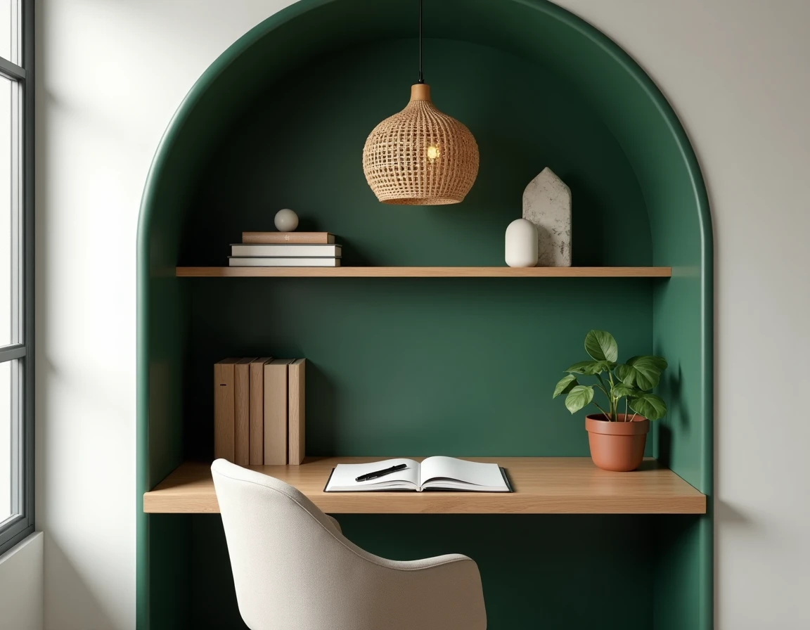
The minimalism we once knew, with empty surfaces and a monochrome palette, is losing ground. Soft minimalism retains clean lines but reintroduces what pure minimalism had banished: plush textiles, personal objects, and vintage finds.
You may also like : How to Boost Your Business with Current Entrepreneurial Trends
The nuance lies in the selection. We keep few elements, but each carries an emotional weight or a material quality that justifies its presence. A raw wool throw draped over a straight-lined sofa, a framed photo on an otherwise empty shelf: these details are enough to warm up a space without overwhelming it.
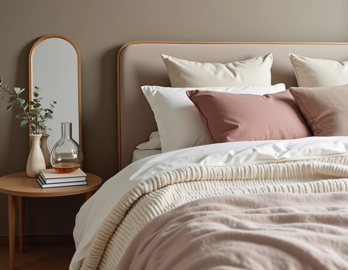
Interiors that are too stripped down are now perceived as cold. The shift is towards warm colors than pure white: beige, greige, pale terracotta. Natural materials like wood, linen, or stone contribute to this softness. To explore accessories and furniture that fit this approach, catalogs like justindeco.fr help identify pieces with simple lines and refined finishes.
Related reading : Decor and Architecture Inspiration: Trends and Ideas to Enhance Your Interior
Mixing decor styles without losing coherence
Online competitors treat each style as a standalone block: Scandinavian, bohemian, industrial. The reality of successful interiors is different. The dominant trend is to combine a maximum of two to three universes in the same space, connecting everything with a common thread.
This thread is often the color palette. Two main shades and one accent shade are enough to unify a living room where a vintage corduroy armchair coexists with a raw metal coffee table. The material can also serve as a binding agent: wood, present in a frame, a lamp base, and a shelf, creates a visual continuity even between pieces of opposing styles.
Errors that disrupt a mix of styles
- Accumulating more than three different stylistic references in the same room, which produces a flea market effect rather than a composed interior
- Neglecting proportions: a massive industrial-style piece next to a slender Scandinavian seat creates a visual imbalance that color cannot correct
- Forgetting the voids: the void is a compositional element, not a lack to be filled
Natural materials and traceability: what is changing in the choice of decor objects
The attraction to natural materials is not new. What is evolving is the demand for traceability. There is a significant increase in demand for decor objects whose origin, composition, and impact are documented, particularly in the accessories segment: cushions, textiles, candles, small items.
Certified wood, organic cotton, and locally crafted ceramics are gradually replacing standardized products. This movement also affects furnishings: low-VOC paints or lime-based coatings are gaining ground in decor renovation projects.
A traceable object often costs more per unit but fits into a logic of reduced purchasing. Fewer pieces, better chosen. This approach aligns with the soft minimalism mentioned earlier: the quality and provenance of each element become criteria for decoration in their own right.
Trending colors for the living room and common areas
Current palettes are moving away from the omnipresent gray of the previous decade. Earthy tones dominate: terracotta, ochre, warm brown, sage green. These colors work well as a solid on an accent wall or as touches distributed through cushions, a rug, or decorative tableware.
How to test a color before painting a wall
Applying a sample directly to the wall remains the most reliable method. The natural light in a room radically alters the perception of a shade. A sage green may appear gray under north light and distinctly green under south exposure.
It is advisable to paint a square of at least fifty centimeters on each side and observe it at different times of the day. The evening color under artificial light matters just as much as the morning color.
Biophilic design: integrating plants into interior design
Biophilic design goes beyond placing a few plants on a piece of furniture. It involves integrating greenery into the very structure of the space: a stabilized green wall in an entryway, a planter built into custom furniture, hanging plants that visually delineate an area of the living room.
Raw materials contribute to this logic. Exposed stone, unvarnished wood, and woven fibers evoke outdoor textures and create a continuity between inside and outside. The resulting ambiance affects the perception of space, making it seem larger and more soothing.
- Favor plants suited to the actual light conditions of the room rather than trendy but unsuitable species
- Vary the heights of vegetation (floor, table, hanging) to create depth
- Pair greenery with pots made of natural materials (wicker, terracotta, stoneware) to enhance the coherence of the whole
Current decor trends converge towards a common principle: an interior that reflects a lifestyle rather than a catalog. Soft minimalism, the controlled mixing of styles, and the demand for material traceability form a common foundation. The rest is a matter of light, proportions, and what we choose to keep on a shelf.